OMO Matcha
A Korean-inspired matcha brand built around wellness, culture, and everyday rituals
Project Overview
Role: Brand Designer | Product Designer | Packaging Designer
Project Type: Personal Branding Project
OMO Matcha is a personal branding project inspired by my Korean heritage and my love for matcha. I wanted to create a product that felt personal while solving a real lifestyle problem I noticed among busy parents and professionals: finding a healthier, more sustainable alternative to their everyday coffee routine.
The goal was to create a matcha beverage that combines cultural storytelling with modern wellness — something that feels both meaningful and approachable.
The Inspiration
Connecting my roots with something I love
As someone with Korean roots, I have always been drawn to the intentionality and simplicity found within Korean culture. Especially through food, traditions, or everyday rituals, there is an appreciation for slowing down and finding balance.
My love for matcha inspired me to explore how I could bring that same feeling into a modern beverage brand.
OMO Matcha became a way to celebrate where I come from while creating something that fits into the fast-paced lifestyles people live today.
The Problem
The search for better energy
Coffee has become a daily routine for many people, especially my busy parents who rely on caffeine to get through long days. While coffee provides a quick boost, many people experience energy crashes, dependence on multiple cups, or simply want a cleaner alternative.
I wanted to explore:
How can we create a caffeine option that supports energy, wellness, and balance without losing the convenience people love about coffee?
The Brand Concept
OMO Matcha: A moment to recharge
The name OMO comes from the Korean expression “어머 (omo),” which is often used to express surprise, excitement, or appreciation.
I wanted the brand to represent those small moments throughout the day where you pause, reset, and take care of yourself.
Instead of viewing caffeine as something people need to get through the day, OMO Matcha reframes it as a mindful daily ritual.
Target Audience
Inspired for my busy parents who want healthier routines, but also for anyone who is needing a healthier caffeine choice
OMO Matcha was created for people who:
Start their mornings with coffee but want a healthier option
Need consistent energy throughout the day
Value wellness but do not have time for complicated routines
Appreciate products with a personal story behind them
The brand is designed around the idea that taking care of yourself does not have to be another task on your list — it can be built into your everyday habits. My interest in health has always been centered around understanding how small daily choices can impact the way we feel and perform. Through my own experiences with fitness, nutrition, and maintaining a balanced lifestyle, I became interested in how the products we consume can either support or work against our overall well-being.
This curiosity led me to explore matcha as more than just a beverage — but as a healthier ritual. Matcha represents balance: a source of natural energy, a mindful preparation process, and a connection between tradition and wellness.
OMO Matcha became my way of combining my passion for health with my Korean heritage to create a product that encourages people to make intentional choices in their everyday lives.
Brand Direction
Bringing Korean minimalism into modern wellness
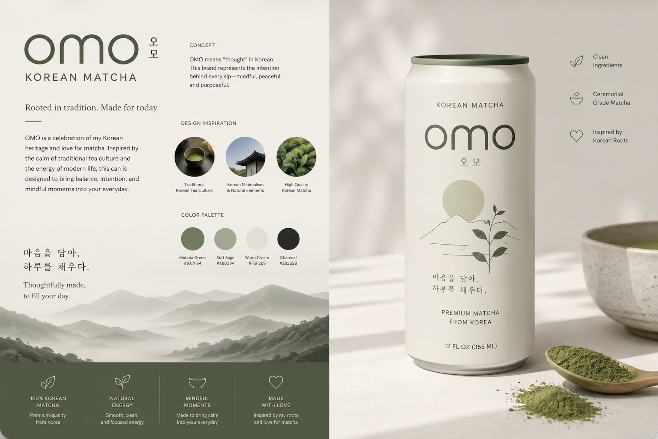
The visual identity combines elements of Korean design with a contemporary beverage aesthetic.
I was inspired by:
The simplicity of Korean design
The connection between nature and wellness
Traditional tea culture
Modern health-conscious brands
The goal was to create packaging that feels calm, premium, and approachable.
Packaging Design
Designing a healthier caffeine experience
The packaging was created to communicate three things:
Clean. Intentional. Connected.
The design uses a minimal approach to reflect the calming experience of drinking matcha while incorporating subtle Korean influences.
Key design elements include:
A simple and recognizable logo
Natural colors inspired by matcha and Korean landscapes
Clean typography
A premium but approachable feel
The goal was to create something that could sit next to traditional coffee products while offering a completely different experience.
Final Product Vision
OMO Matcha is more than a canned beverage — it represents a shift in how we think about energy.
Instead of:
"I need coffee because I am exhausted."
OMO encourages:
"I am choosing something that helps me feel balanced throughout my day."
Reflection
Creating OMO Matcha allowed me to combine my personal background, creativity, and interest in consumer experiences.
This project reminded me that the strongest brands are built around stories people can connect with. OMO is not just about matcha — it is about creating a small moment of balance in a busy day while celebrating the culture and traditions that inspired it.