Email Sign-up Page
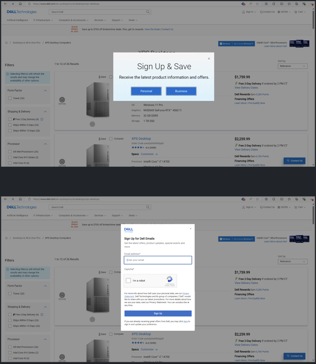
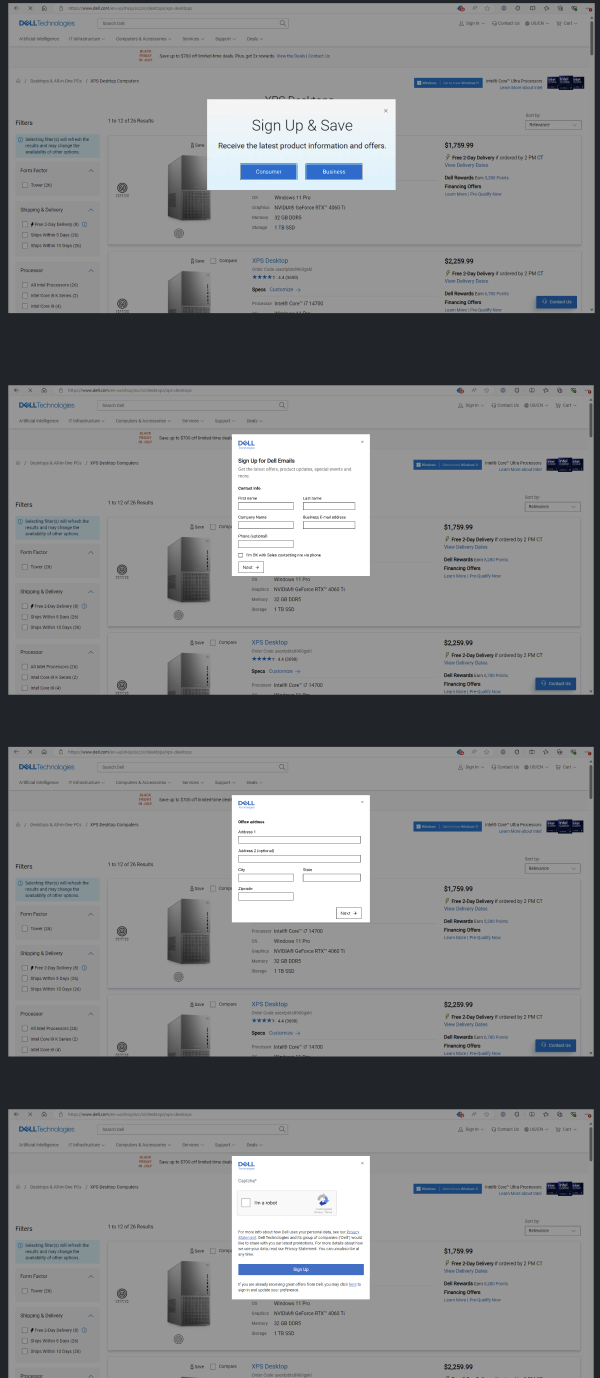
Dell's email sign-up experience was underperforming due to a lengthy, outdated, and inconsistent user flow that created unnecessary friction during registration. The existing experience did not align with Dell's evolving design system, lacked a mobile-first approach, and made it difficult for users to quickly understand the value of subscribing.
The challenge was to redesign the email sign-up experience into a simple, intuitive, and responsive interface that increased user engagement, reduced drop-off, and seamlessly integrated with Dell's Design System while supporting business goals of growing Dell's customer marketing database.
The Original Dell Email Sign-Up Page
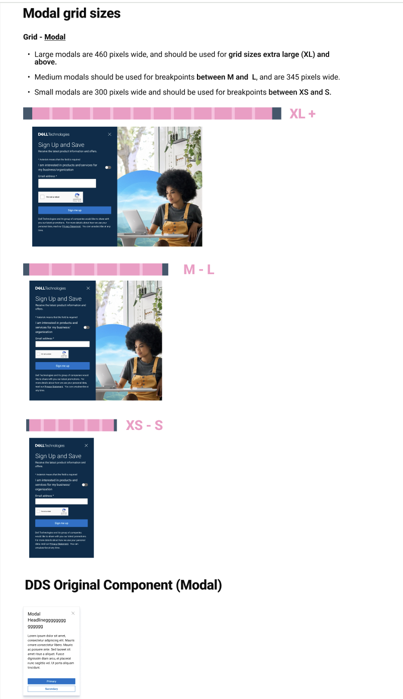
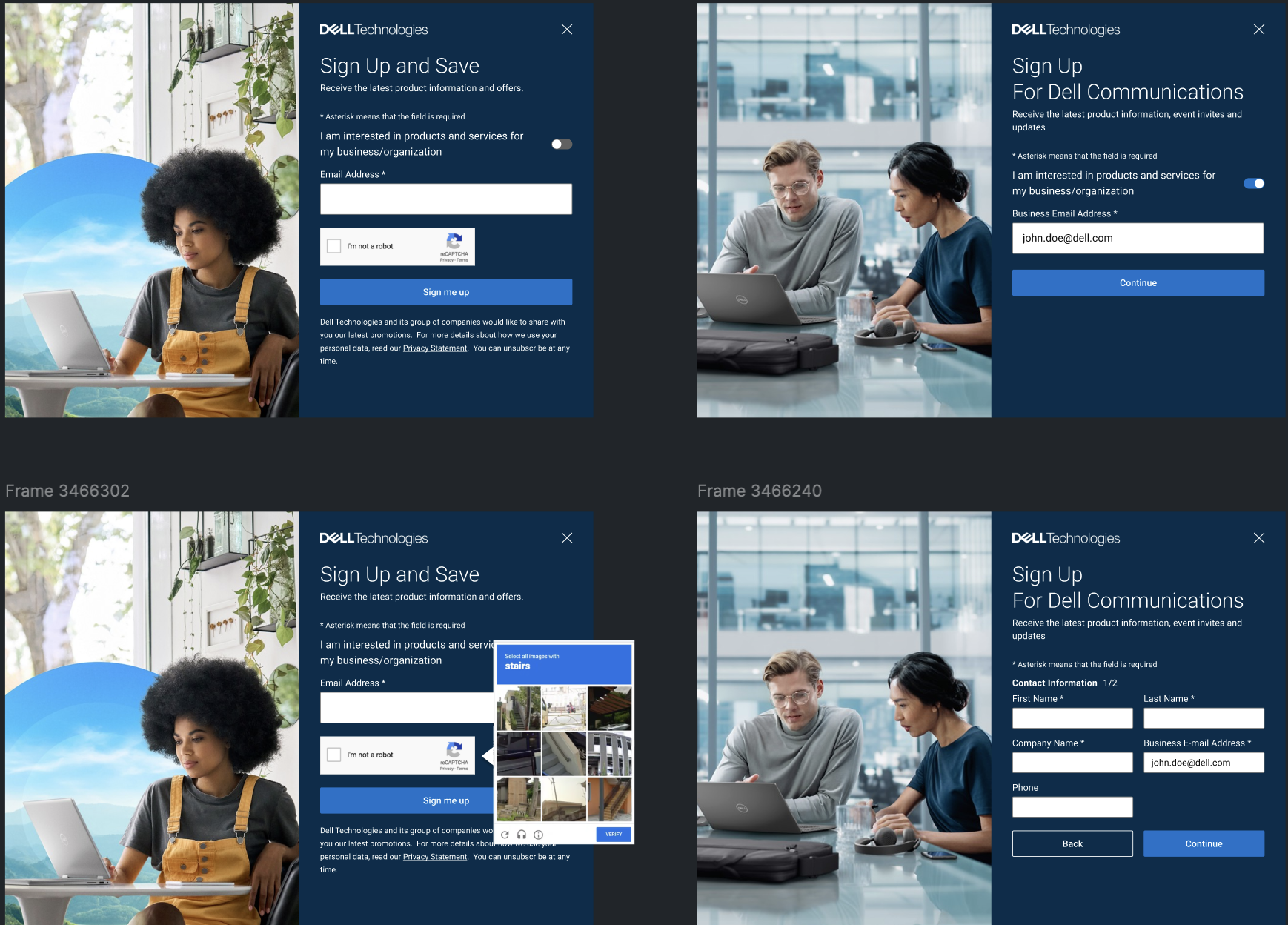
Redesigned Dell Email Sign-Up Page
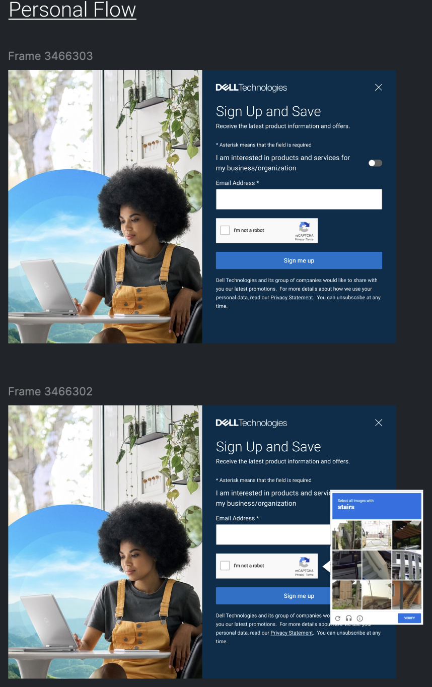
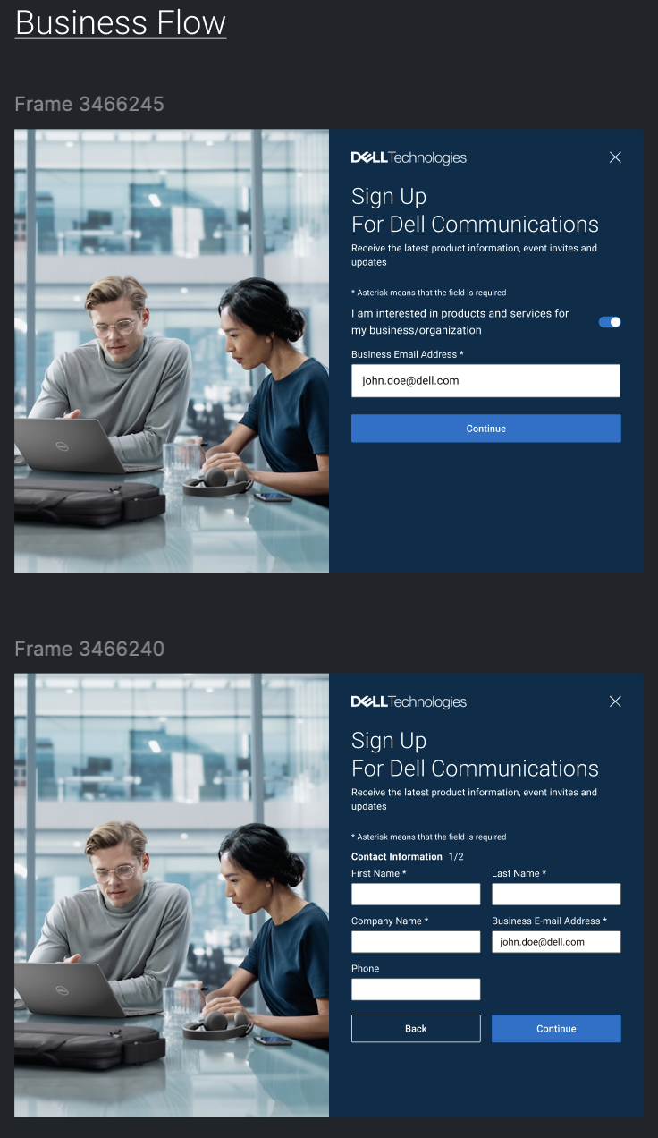
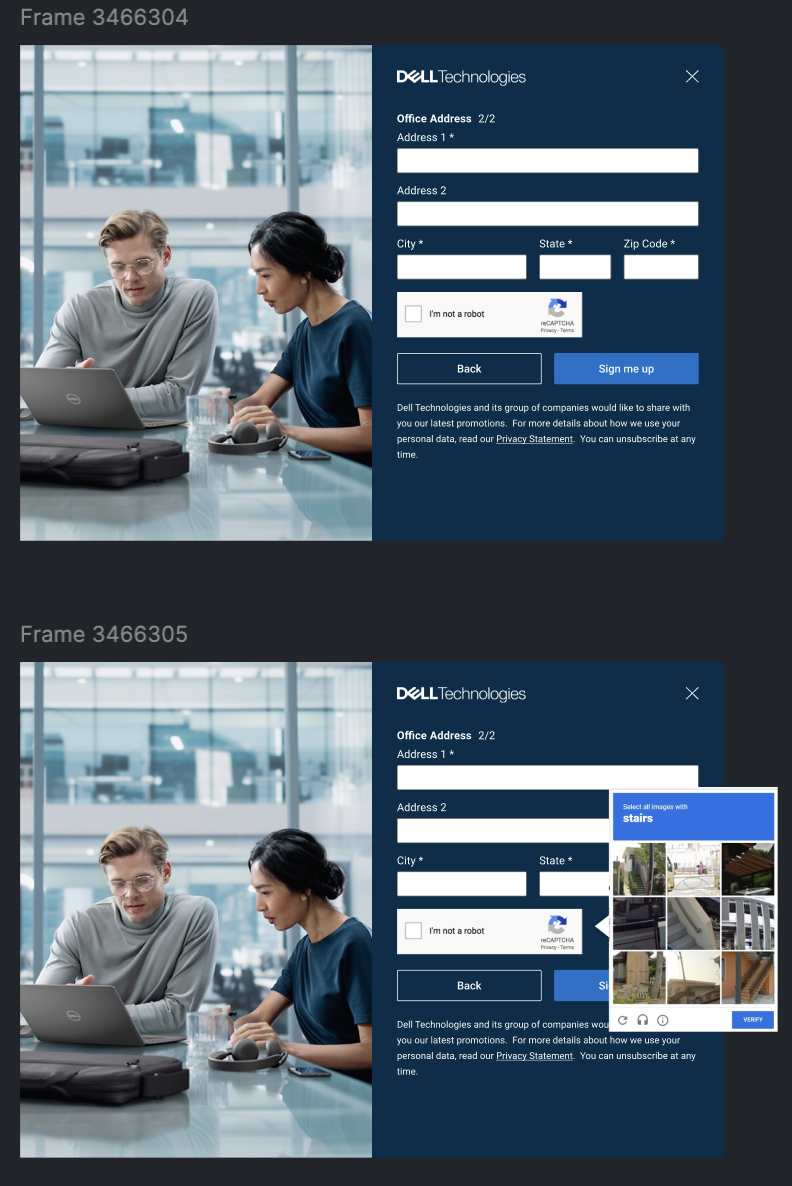
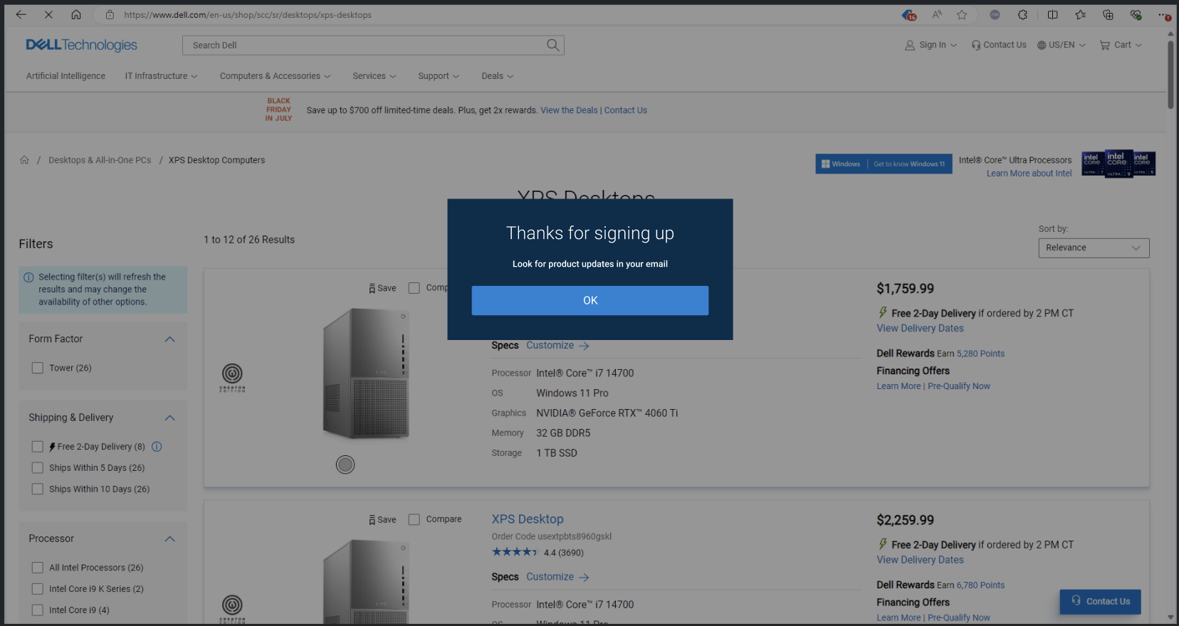
Redesigning Dell's Email Sign-Up Experience
Role: UX/UI Designer
Timeline: 2024
Team: Product Managers, Engineers, Marketing, Content Strategy
Overview
As part of Dell's Digital Experience team, I redesigned the email sign-up experience to create a more seamless and engaging registration flow. The objective was simple: make subscribing easier for users while increasing marketing acquisition for the business.
The previous experience contained unnecessary friction that discouraged users from completing the form. It also lacked visual consistency, wasn't fully optimized across devices, and did not effectively communicate the benefits of subscribing.
My Process
I began by collaborating with product managers, marketing stakeholders, and engineers to understand both user needs and business objectives. After reviewing existing analytics and identifying areas where users abandoned the process, I explored opportunities to simplify the experience.
I created multiple wireframes and high-fidelity prototypes in Figma, focusing on reducing cognitive load, improving visual hierarchy, and designing a fully responsive experience. Throughout the design process, I worked closely with developers to ensure the solution aligned with Dell's Design System and could be implemented efficiently.
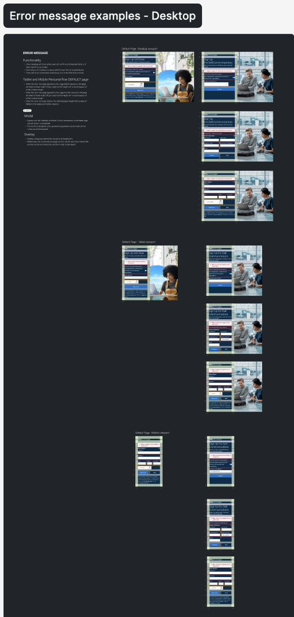
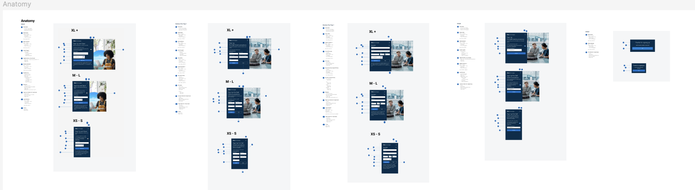
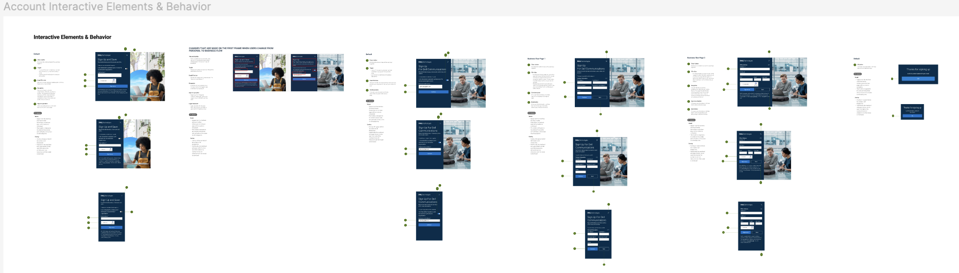
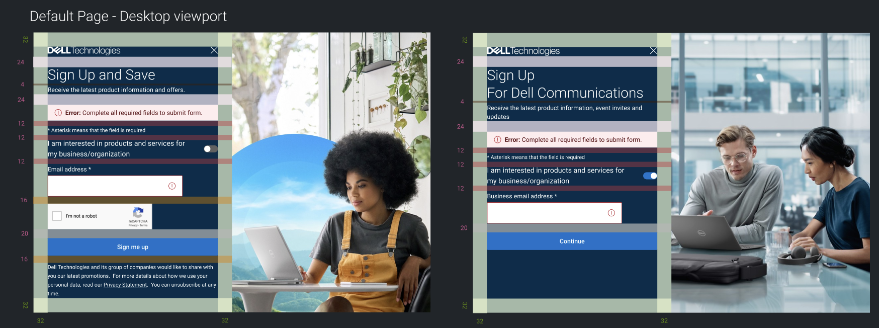
After several rounds of feedback and iteration, I documented the final designs, interaction behaviors, and design specifications to support development and maintain consistency across the experience.
Design Decisions
Simplified the form layout to minimize user effort.
Improved information hierarchy to clearly communicate the value of subscribing.
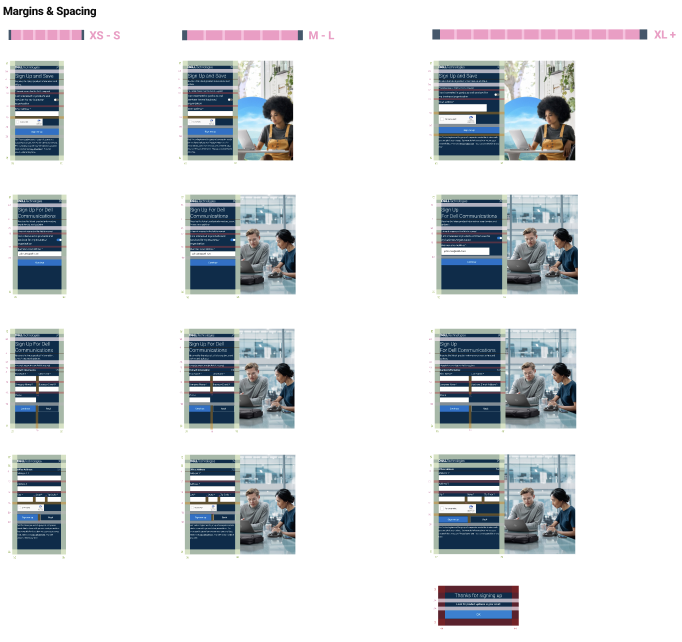
Designed responsive layouts for desktop and mobile experiences.
Standardized components using Dell's Design System for consistency and scalability.
Reduced visual clutter while maintaining accessibility and usability best practices.
Outcome
The redesigned email sign-up experience generated measurable business results:
174,000+ net new customer registrations
$14M+ in attributed revenue
Improved user experience through a cleaner, more intuitive registration flow
Established a scalable design pattern for future marketing experiences
Reflection
This project reinforced the importance of balancing user needs with business objectives. Small improvements in usability can have a significant impact when applied to high-traffic experiences. It also strengthened my ability to collaborate across product, engineering, and marketing teams while designing solutions that were both user-centered and data-driven.
Documentation done for the development team